Visual identity: The story behind one Bromford.
You may have noticed that Bromford recently gained a new look. What you may not know is the kind of thought that goes into coming up with a new identity. In today's blog, Bromford chief creative and design extraordinaire Steve Barnes tells us the story behind one Bromford...
The chance to change the visual identity of a business that helps over 60,000 customers. It’s an idea that instills one of two emotions in a designer; excitement of getting to flex your creative muscles, or the fear of “what am I going to do?”
For me it was somewhere between the two. I’ve lived and breathed the Bromford ‘Group’ brand since I helped bring it to life in 2007. It’s been a part of my very being for five years and so it’s been very difficult to suddenly think outside the box and step away from something that you’ve nurtured and developed, and ultimately come to understand in a way that no-one else has.
But as a designer you have to turn the page, clear your thoughts and think fresh.
But how? Where do you start? It isn’t simply a case of let’s throw some shapes, fonts and colours together and see what sticks. It’s a long process and one that I’d like to share with you.
Hopefully this blog will help explain the road I took to get to where we are today.
Why?
As a designer I have over a dozen years of experience at managing and developing brands, and the thing I’ve realised (quite quickly) is the simple fact that no matter who you are and how big your business, from a one man band to a multi-national company, you have a brand whether you like it or not. It’s about recognising this and acting positively so your brand really represents who you actually are.
One of the first questions you need to ask yourself is: “If it isn’t broke, why fix it?”
The trouble is, what Bromford had, whilst not broken, wasn’t fit for purpose and didn’t serve our needs. As a business we have changed and so we need our brand to reflect these changes.
Bromford Group was a family of lots of brands. We had the ‘Bromford Group’ identity to represent our central services, the operating brands of Support, Living and Homes, and then we had developed some product brands (which have significantly grown in number over the last five years). This is natural and will happen over time in any business of our size, but every so often you need to take stock and see if your brand message is getting diluted. This is where we were starting from, and my brief was simple:
We want to be one Bromford.
So, where do you start? How do you make your mark on that first blank page?
First you step back and see where we are.
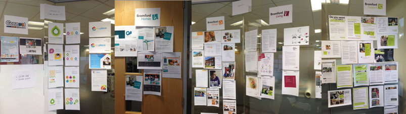
This is a range of collateral that we have for each of our brands, be they operational or product. It isn’t until you see all of these things in front of you that you can start to get a feel for what you need to do to simplify the brand.
 So after looking at everything, we analysed what we wanted.
From this we could begin to see what needed to stay, what could be discarded and what we needed to think about in more detail.
We looked at other businesses and analysed their brand structure and hierarchy.
Ask yourself:
Where do you want to sit? Do you want the clean and simple Apple “iMac iPad etc” approach? The warm but slightly individual feel of the Virgin family? Or do you want the ‘to hell with the parent brand, lets focus on individual products’ of Proctor and Gamble?
We tried to place ourselves into these different structures to see how we’d fit. Initially we thought we wanted to reflect the model Virgin used, but visually once we stepped back and looked at Virgin’s overall brand, it was as eclectic as our own. You can see the difference between their brands and that they weren’t part of one single brand review, they’re all unique, apart from the Virgin Moniker that runs through them. If we wanted our brand to use the Virgin model then we already were fairly close before we even started.
And that’s where our first challenge arose and this was, in my opinion, the light bulb moment on the rebrand.
It’s this kind of thinking that helps you move a brand forward. It’s very difficult to allow your creative mind to let go of an idea if you don’t undertake these kinds of discussions and this level of research. This is why rebranding isn’t a quick job and should never be undertaken lightly. It requires some blunt honest thinking and some brave decisions, and I was fortunate in that Bromford was in the right place for me to approach it with a completely fresh mind-set. My canvas was completely blank.
The concepts
Our initial research and work on hierarchy led us to work up various concepts along the way. I’ve given a brief explanation below of the key ideas that moved us forward, with an explanation of the importance of each concept.
I suppose it could be considered unusual to show brand ideas that didn’t make the cut, but two of the most interesting pieces I’ve read on branding over the last year, showed the intimate working of how a brand comes to life. The first was about ITV’s rebrand and then Yahoo’s 30 logos project last august.
It’s this sort of openness that helps to show the level of work, consideration and commitment that goes into a rebrand.
So which ones were key to our development?
Concept 1 - G to a B:
 It’s the first logical step. We’re losing the Group from Bromford, so why not simply change the G to a B?
It was the first thing we were asked to consider when we started this process, and it’s a sensible question.
I knew early on that this wasn’t the way to go with our brand, but the mistake some people would make is to discard it without looking at it.
Rather than simply discussing an idea, sometimes it’s easier to understand why an identity isn’t suitable by developing it and creating a full sample of collateral (like images of our vans or a standard leaflet).
This helped show, visually (remember I’m a designer), the issues we would face by keeping all of the individual identities for the products we currently have. That original brief of ‘one Bromford’ is still being diluted, somewhat lost even. Also the main logo hasn’t moved on, because it maintains a core of the old brand it now feels unbalanced and unfamiliar, it hasn’t really progressed enough to be a noticeable step forward.
Really, it lacked the standout nature we were looking for and would be similar to lots of other businesses in our field. We want to be instantly recognised, and G to B just wouldn’t do that for us.
Concept 2 - The Adaptive Brand
 This idea allowed us to develop a step forward with the main logo but still allow individual product brands to have their own identity. The concept for the adaptive brand revolved around four shapes (representing Homes, Group, Living and Support) that are now combined to create one ‘shape’ (Bromford). The idea then being that each product brand would have a variation of this shape unique to it. We could create an endless variation of these for any new products in the future.
The drawback with this concept is that without a Bromford moniker in front of the product, the idea of ‘one Bromford’ would lose impact. There would still too be much of an individual feel to each product.
Second Phase development
We soon realised our thought process was taking us down the wrong path, so we went back to the brief and looked at what the other routes we could follow were. This helped us develop two new concepts.
The first was a structure that had a clear definition of what was a product, whilst maintaining Bromford as the prominent brand.
The second approach was more radical. No sub-brands, no product brands, just Bromford. Bromford full stop.

This was where our new brand was born, although we didn’t realise it at the time. We’d used the phrase regularly and over time it began to grow as a concept. Before we realised, we we’re scribbling notes and getting far too excited about how ‘Bromford Full Stop’ could work.
Concepts three and four were worked up in a lot more detail as we felt we’d come across something that was worth investing a lot more time in.
Concept 3 - The ‘B’ in Bromford.
 The concept here was a joint idea between the ‘B’ in Bromford, but also around the idea of ‘leaving our mark, wherever we are’. The ident was designed around a map pin, symbolising our input wherever we work, no matter what service we provide.
Concept 4 - Bromford ‘Full Stop’
Probably the simplest visually but for me has the strongest identity. The concept is simple, no matter who we are, what we do and what services we provide, we’re Bromford, full stop. There are no individual logos or sub-brands and wherever you interact with us, you’re dealing with Bromford. We still refer to our support service, our shared ownership homes and still use Connect as our social network for jobs and skills, but visually there are no different logos and identities. It's just Bromford.
As you’ll see from the website you’re on right now, Bromford full stop won the battle of the brands.
What next?
Things are already beginning to change. Things like our social media and web presence are all updated to the new identity, and physical items like the vans and signage will change over the next six months or when they’re due to be replaced anyway. We didn’t want to just spend unnecessarily; it wouldn’t be appropriate in the current economic climate.
So what did I learn? What advice would I give?
First of all, rebranding isn’t easy, nor is it straightforward.
Only time will tell if I did this the best way and produced the best result. We’ve really taken the time to think through these changes and I’m confident that we now have in place both the core strength and visual identity to ensure our identity is robust for the future. I think we’ve been bold, I definitely think we’ve been brave, and I like to think we’ve been different.
Rebranding is not a quick or simple process. It's necessary to take the time to look at your organisation with an open mind and assess where you are, where you were and where you want to be. You need to consider how you want to be seen and what business gang you want to be part of. It isn’t just about putting a new logo on your letterhead and thinking that changes everything, because, well quite simply it doesn’t. The change needs to come from deeper within the business and reflecting who you really are. You need to ensure that identity really portrays you genuinely and honestly, it’s a strange concept but integral in helping people understand who you are.
I’m fortunate to work for a business where the culture allows us to be brave in every project we take on and every challenge we face. To really try new things and to make bold steps in how we portray our brand to the outside world.
In the end, I’m glad I’ve got to be a part of...
![]()
 |
Steve Barnes is Bromford's 'Creative', designing the look of everything at Bromford from leaflets to brochures, logos to case studies. Follow him on twitter: @Doubleyouvee |